


April US Treasury Bond Auctions
Primary Interest Rates continue to Spike

I have now segregated US bond auction updates into their own separate post. This is the 2nd of a monthly series of posts updating the bond auction rates and bid to cover ratios. I have previously covered these within the weekly updates. I consider this to be the most important part of what I am covering on the substack and it is where we will see the first signs of distress within the market that the federal reserve cares about the most.
You can view last months post here.
Please refer to the Backdrop Post and trade with mindfulness.
Please refer to Definitions page for any terms or abbreviations that I use that you don’t understand. If a term is missing, please let me know.
Table of Contents
State of the Narrative
Primary Auction Results April
Bid to Cover Ratios
Interest Rates
Secondary market Treasury rates
Market Impacts
Conclusion
1. State of the Narrative
As usual we will start out with a State of the Narrative, this one will be shorter than the initial segment in February as we simply have to cover the changes over the last month.
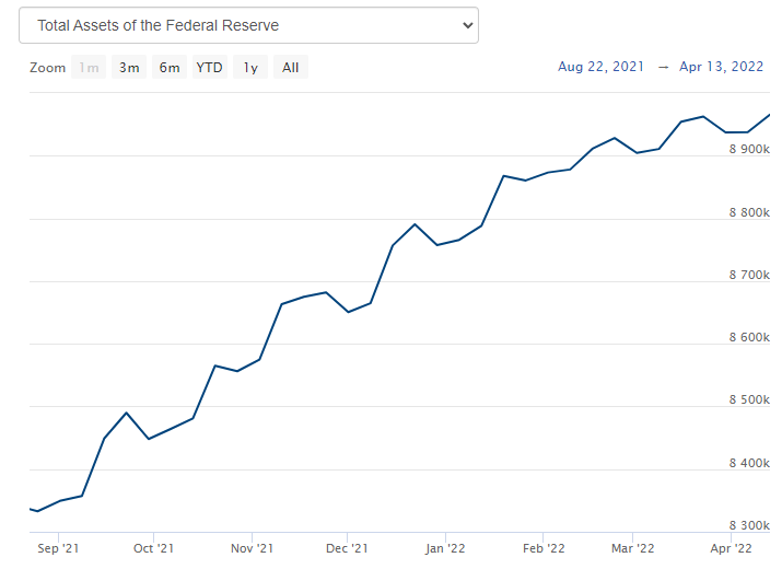
The Fed is supposed to have ceased asset purchases as of March 15th, but this past week the Fed’s balance sheet grew by $28 billion worth of assets. I can’t really tell if they have completed their taper as the top line of their total assets keeps increasing, although it has slowed a lot. Considering that as debt retires, the Federal Reserve has to replace it and receive the interest from those assets, it is possible that the increase in the top line of their balance sheet may be an aberration resulting from the income received from these expiring assets. It is tough to tell considering how large the Federal Reserve’s Balance Sheet is.
For continuity sake, below is the same chart of the yield from the 2 year US treasury note that I have provided in every single one of these treasury bond posts. Each post has been accompanied by an orange dashed line to better help you to visualize how much yields have grown over the course of a month. As you can see below, the rate of interest rate growth has accelerated from the previous month.
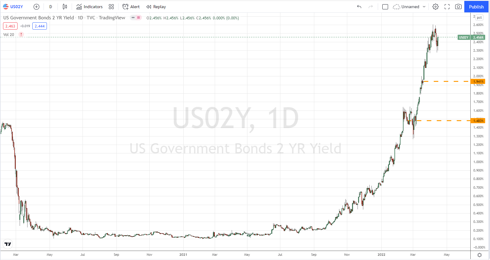
You will note that over the course of 1 month, the interest rate on the 2 year treasury note has risen by over 0.5% over the course of a month. At this rate, by next month we will have higher interest rates on this yield than we reached in the height of the 2008 market crash.
If you follow some of the chart nerds on YouTube you have probably seen a few charts like the one below which I am going to explain, and then explain why the conclusions most people are reaching about this chart are wrong.

This is a chart of interest rates on a weekly basis (each bar equals 1 week). The blue descending line is a trend line tracking how interest rates over the past 3 decades have been putting in consistently lower highs. This sort of analysis is basic technical analysis. The thing about technical analysis is that it works until it doesn’t, because every trend is eventually broken. The chart nerds would tell you that treasury yields would hit the descending line and then reverse and continue the trend. This is wishful thinking. There are times when fundamentals (the basic underlying mathematical supply and demand) overwhelms technical analysis. This is one of those times. Treasury bonds are in a cascading freefall, there is simply 0 demand while the federal government is attempting to force-feed more supply on to the market than they ever have in history. The only result that could ever happen is for yields to spike indefinitely until we find an interest rate at which the free market is willing to fund the current $3+ trillion deficit of the federal government now that the federal reserve is no longer printing money to buy these treasury bonds.
But it gets worse…
Last week the Federal Reserve released their minutes of last months interest ratee decision. I have pulled quotes from CNBC about those minutes, that essentially line up with what one FOMC governor (Lael Brainard) said in the minutes.
“The [FOMC] will continue tightening monetary policy methodically through a series of interest rate increases and by starting to reduce the balance sheet at a rapid pace as soon as our May meeting,” she said. “Given that the recovery has been considerably stronger and faster than in the previous cycle, I expect the balance sheet to shrink considerably more rapidly than in the previous recovery, with significantly larger caps and a much shorter period to phase in the maximum caps compared with 2017-19.”
Essentially, the Federal Reserve is now telegraphing that they will be selling the treasury bonds they hold on their balance sheet into the secondary markets. They are going to push the markets to an even further imbalance next month. In the previous “recovery,” the Fed was selling assets at a rate of $50 billion per month, so that is the lowest level we can expect of additional assets the Fed wants to push into a market where no one is buying, only selling. Any money manager that is holding a bond portfolio (lol, why?) should at this point be roused from their slumber to sell out of their position before the Fed comes in to increase the amount of treasuries being sold. They have to front-run the Fed unless they are totally asleep at the wheel. I expect an even faster rate of growth for interest rates on treasuries when the Fed engages in this policy. If they were smart, they will keep making excuses about why they can’t sell off their balance sheet just yet. Keep kicking that can down the road. But I suspect that the pressure of inflation and their own hubris will push them to engage down this foolish path. Japan falls on its own sword, Europe chooses heroin, what cultural metaphor will I pick for America’s financial demise? I guess we are about to rupture the gastric band we had surgically added to our stomach to stop us from over-eating. I don’t know, this metaphor feels hollow. I’ll find the right one in due time.
Keep reading with a 7-day free trial
Subscribe to Flirtcheap’s Asymmetric Economics to keep reading this post and get 7 days of free access to the full post archives.